Blog


Supercharge Debugging with New Visualization Features

We’ve all been there – staring at metrics trying to make sense of a system issue as several minutes tick by. I want to cover some of the visualization features in Observe that might actually make troubleshooting less painful and more intuitive.
I’ve been playing with these visualization options, and they’ve helped me in quickly spotting patterns and anomalies that would otherwise stay hidden in the noise. Let’s dive into what these features are and how you can leverage them to reduce MMTD and MTTR.
Heat Maps: Find Patterns in Distribution
Heat maps have been my go-to for spotting unusual distributions in latency, request counts, or any high-cardinality data. The color gradients instantly highlight where your values cluster and where the outliers lurk.
For example, visualizing request latency across your services as a heat map immediately exposes which services have consistent performance versus those with a long tail of slow requests. This is crucial for pinpointing where optimization efforts should focus. In the chart below I am plotting the metric nginx_ingress_controller_ ingress_upstream_latency_seconds, measuring the time in seconds it takes for the Ingress Controller to receive a response from its upstream (i.e., the backend service that ultimately processes the request). Essentially, it captures how long it takes the NGINX Ingress Controller to forward a request to a backend and get the first byte of the response back.

Change Over Time: Spot Trends Before They Become Problems
The new change-over-time visualization is like having a built-in crystal ball. It highlights percentage changes between time periods so you can catch concerning trends before they become incidents.
I’ve found this particularly useful for capacity planning. Seeing that your API requests across different clusters can give you hints where to prioritize your scaling efforts.
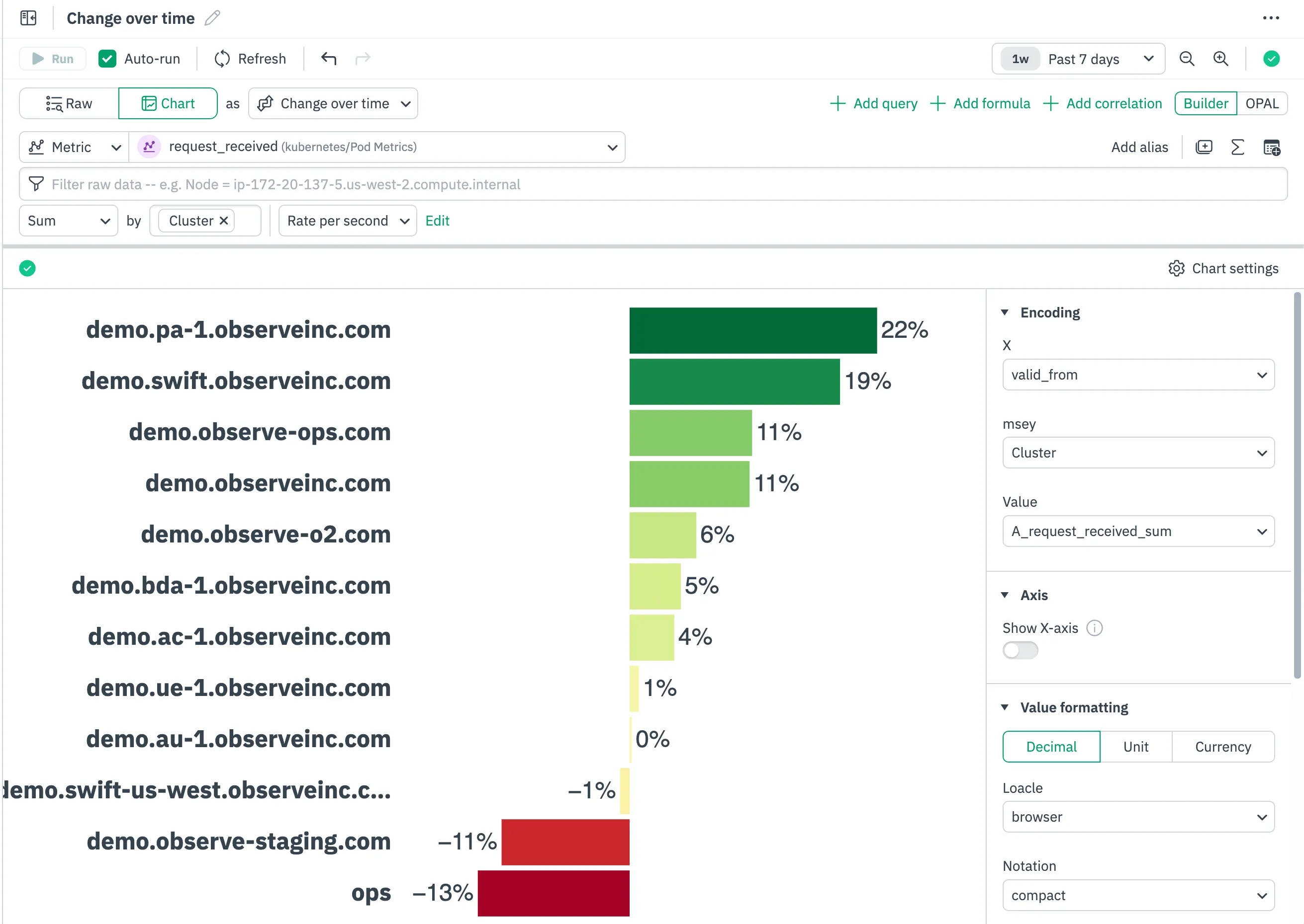
The visualization uses a sensible color gradient (green for increasing scalability, red for rightsizing) that makes weekly reviews much faster than staring at raw numbers.
Top List: Cut Through the Noise
The new Top List visualization is surprisingly powerful for its simplicity. When you’re dealing with hundreds of services, pods, or endpoints, Top List helps you focus on what matters most.
For example, when investigating usage or load issues, I typically want to know which clusters are the top consumers:

What makes Observe’s implementation better than a basic table is the built-in visualization – each entry gets a bar proportional to its value, making it trivial to see not just the ranking but the relative differences between entries.
Scatter Plots: Find Correlations and Outliers
Scatter plots are indispensable for discovering relationships between metrics. Want to know if memory usage correlates with request latency? Or if memory spikes align with specific error rates? Scatter plots make these relationships pop.

We have added some nice touches like customizable markers that help differentiate between data series, and hover details that show the exact values at each point.
Enhanced Legends with Summary Statistics
This seems like a small feature, but it’s a massive time-saver. The new legends don’t just show what color corresponds to which service – they include summary statistics like min, max, average, and trend indicators.
When comparing performance across multiple services, I no longer have to mentally calculate or visually estimate the differences – they’re right there in the legend. This has sped up my investigation workflow considerably.
Overlaying Multiple Chart Types: Context at a Glance
Being able to overlay different chart types (like bars and lines) on the same visualization is surprisingly powerful. I’ve been using this to overlay error count bars with request volume line graphs:

This creates an immediate visual correlation between your baseline traffic and your error spikes. It answers the question “did errors increase, or did we just have more traffic?” at a glance.
Dual Y-Axes: Compare Different Scales Meaningfully
When metrics operate on wildly different scales, comparing them used to be a pain. Plotting CPU percentage (0-100) against memory usage in MBs would result in one metric being flattened against the axis. With dual Y-axes support, you can now compare metrics of different magnitudes sensibly:

The visualization gives each metric its own Y-axis, so patterns in both become visible simultaneously. This is perfect for correlating resource metrics with business KPIs that might be on completely different scales.
Real-World Application: Troubleshooting Like a Pro
Let’s put these features together for a real-world scenario: investigating an API performance degradation.
- Start with a heat map of request latencies to identify which endpoints have unusual distributions
- Use change-over-time to compare with last week’s performance
- Build a Top List of the slowest endpoints
- Create a scatter plot relating request volume to latency
- Overlay error bars with latency lines using dual Y-axes
- Check the summary statistics in the legend to quantify the performance impact
The entire investigation takes minutes instead of hours, and the visualizations make it easy to communicate findings with your team.
Wrapping Up
These new visualization capabilities in Observe are practical tools that transform how quickly you can go from “something’s wrong” to “here’s the problem.”
If you’re already using Observe, these new visualization options are worth exploring. If you haven’t used Observe, sign up for a free trial and try these visualizations out and let me know which dashboards have been most helpful in your debugging workflow!


