Blog


Dashboards are like Plans

There’s a famous Dwight D. Eisenhower quote, reflecting on his work as Expeditionary Commander in World War II and subsequently President of the United States. I’m not sure I remember it perfectly, but I think it goes: “In preparing for IT operations I have always found that dashboards are useless, but dashboarding is indispensable.” Makes a lot of sense, right?
Dashboards are an artifact coming out of a process, and if you weren’t in that process, the artifact is not going to work as well as if you were in the room where it happened. There’s a mental model, there’s assumptions, there’s shared context. You need all that stuff before data can become information. All by itself, data just tells you the state.
- “The most recent thing that service did was authenticating with AWS RDS.”
- “The current version of this library is 1.2.34.5a.”
- “The amount of remaining storage for this service is 12 Gibibytes.”
Cool, cool. Is that good or bad? It all sounds like “One of these things is not behaving like the others.” So? You have to learn the mental model of why this panel is useful, how panels on a dashboard relate to each other, what assumptions went into the data, what’s left out. All this data is difficult to make decisions with if you don’t have people that understand what it means. That’s why creating dashboards is more useful than looking at dashboards that someone else created.
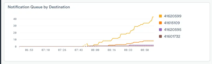
Everything’s Going Up! Is that good?
Dashboards from first principles
A dashboard is used to display big picture summaries and share context. For example when you run into the big NORAD room with Dabney Coleman and Matthew Broderick, you want to see where the missiles are at. If you’re looking to see how much of the dark web you’ve just owned, a dashboard is just the tool. Dashboards are great for movies and TV because the audience needs to get things quickly; and you’ll note that the script always pauses for a bit of infodump to explain what you’re seeing. In an Observability context, that scripted infodump isn’t available, so we need to work together to establish context or bring new folks up to speed.
This kind of dashboard needs to be quickly, almost instantly, understood and accepted by everyone who uses it. In other words, it needs to build situational awareness. That’s perception and comprehension of the state of important elements in the system, and a projection of the expected future. The goal of the big picture dashboard should be minimalism and transparency for the people who need to use it. The thing is, we can’t reach that goal in a vacuum without those people. To the degree that a dashboard can be built and shipped as a one-size-fits-all product, it’s inherently describing something patently obvious and non-specific to your problems. A dashboard that describes your system properly now does not accurately describe the system as it was two years ago, or a similar system at another organization.
A dashboard is also used as an analysis tool, to shape data and drill down from general to specific. Observe’s Explorers are great for this, but if you find your users are taking the same steps over and over again a Dashboard can speed them up. For instance, you might see a value getting repeatedly extracted from a blob, so you could pre-extract it in the dataset definition instead, and maybe present a pie chart panel showing percentages of that value in the dataset. There’s a chance of overusing or misusing those panels though; as with situational awareness dashboards, the humans that work with investigative dashboards need to build intuition for the data and experience with the board. That leads to tweaked copies.
Still, the team makes a generic dashboard which is 80% right. Then daily use in incidents drives live tweaking in order to solve immediate problems; adding and removing filters, changing scale and time ranges, making comparisons so you can look at different conditions side by side. Especially in the heat of an active incident, we might forget and leave a dashboard’s tweaks in place, just as you might accidentally leave a wrench on a table. It’s easy for those learning and using processes to end with myriad copies of slightly modified dashboards and panels. That can cause the dashboards area to become a deep and wide pile of slightly different visualizations that are hard to derive any meaningful situational awareness from.

Productive Dashboards
Dashboards are sort of like new team members, they have to be understood before they are accepted. If the team recognizes a need for a dashboard, it’s quick to make one in Observe and introduce it to everyone. Next, the dashboard’s ability to accurately reflect reality and improve situational awareness should be challenged. Where is this data from, how is it generated and collected, what biases does it reflect, how much does it cost to maintain? Perfection is usually recognized as unattainable, but most DevOps folks will want to know what risks are assumed by or encoded in a dashboard.
Once the dashboard is understood, the whole team can use it productively without a deep dive into the data that backs it, until something changes. In other words, it’s now a Monitoring tool that passively waits for you to return to it and see what it has to say. That can be fine when monitoring is all you need, and maybe that’s sufficient for old and stable systems. That monitoring-friendly stability only lasts until things change though; if the application or data collection changes, the dashboard’s got to be updated. It might also need changing if there’s additions or subtractions in the team that uses it; maybe a new person knows a better technique, or the only person using a panel leaves. It’s perfectly natural for dashboard needs to change over time, reflecting the organization’s growth.
In order to support that growth, a really good dashboard must have great discoverability. Where’s the data coming from, what’s done to it, and who’s made changes when. Those are the sorts of attributes you look for in Observability. An implicit core tenet of Observability is that change happens without warning, and you catch it by observing system outputs.
In Observe we’ve worked hard to make sure that data is easy to find, logic is easy to follow, and pivoting to other useful information about a resource is simple and time-sensitive. What’s different, and when did it become different? Those can be remarkably difficult questions to answer in a lot of systems, but Observe excels at them. You can start a free trial of the Observability Cloud yourself today.


