What’s New: Nav, Workflow, and More
 By Ross Lazerowitz,August 12, 2021
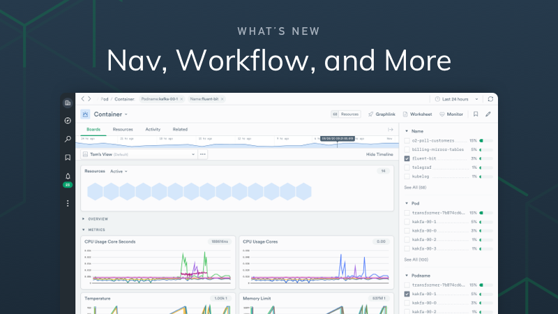
Over the last few months, we’ve received a lot of feedback on how users naturally want to navigate within Observe. We responded with some significant changes to the UI, as well as a few improvements to the overall workflow in our product. We believe users will now find Observe more intuitive and user-friendly than ever before.
Navigation
Browser Tabs
Since the alpha release of Observe, we’ve had a tab management system within our product. But we decided to remove that system and now rely on the tab management built into modern browsers. Why recreate the wheel, right?
Legacy Tab Implementation:
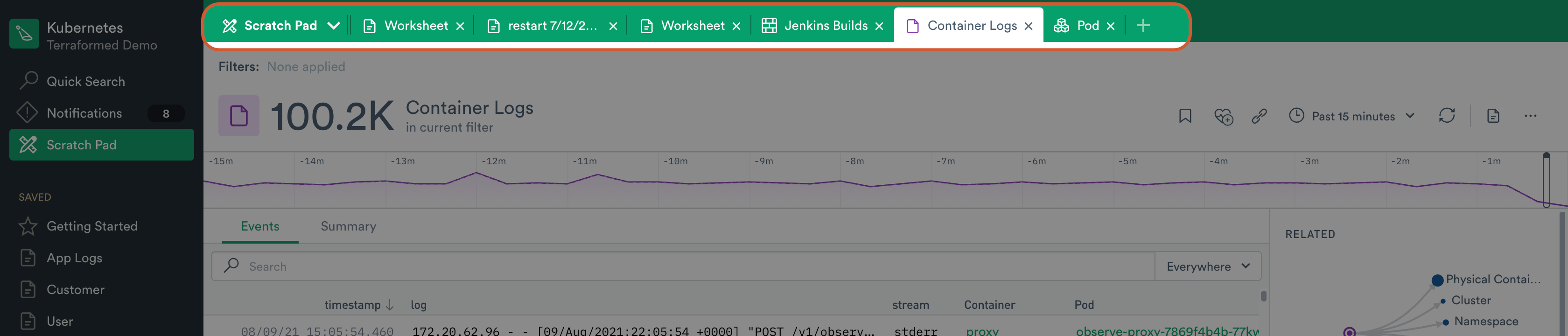
By using features found in all modern browsers — already highly optimized for their memory and CPU utilization management — the Observe UI experience is much snappier. Navigation mostly works as it did before, with the exception you can now right-click on links and open them in new browser tabs. A familiar task for even the least computer savvy. Lastly, the back button now works more predictably.
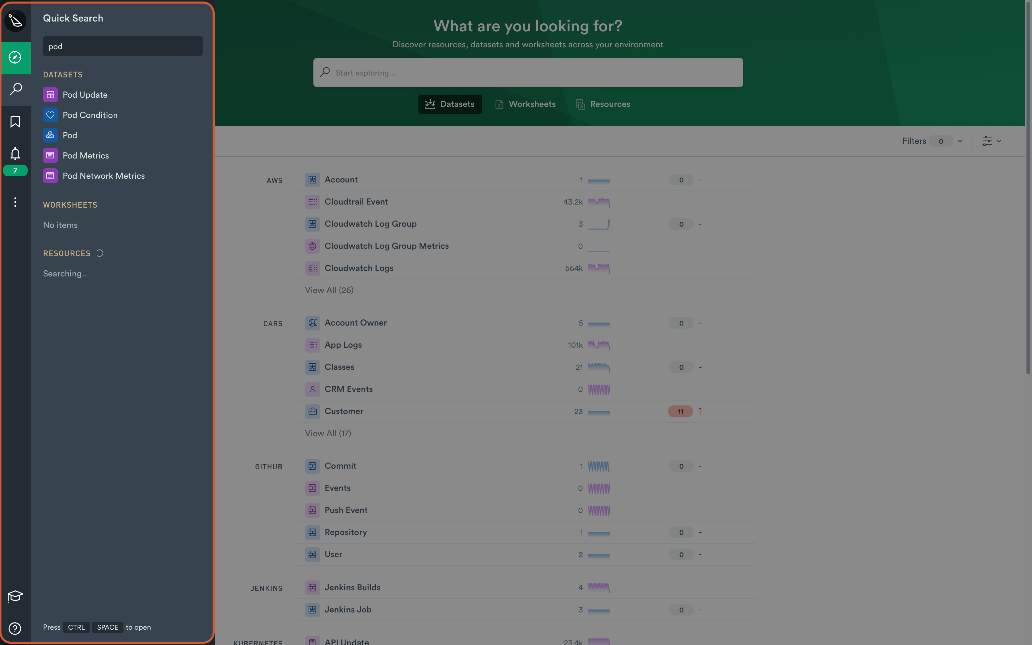
Explore
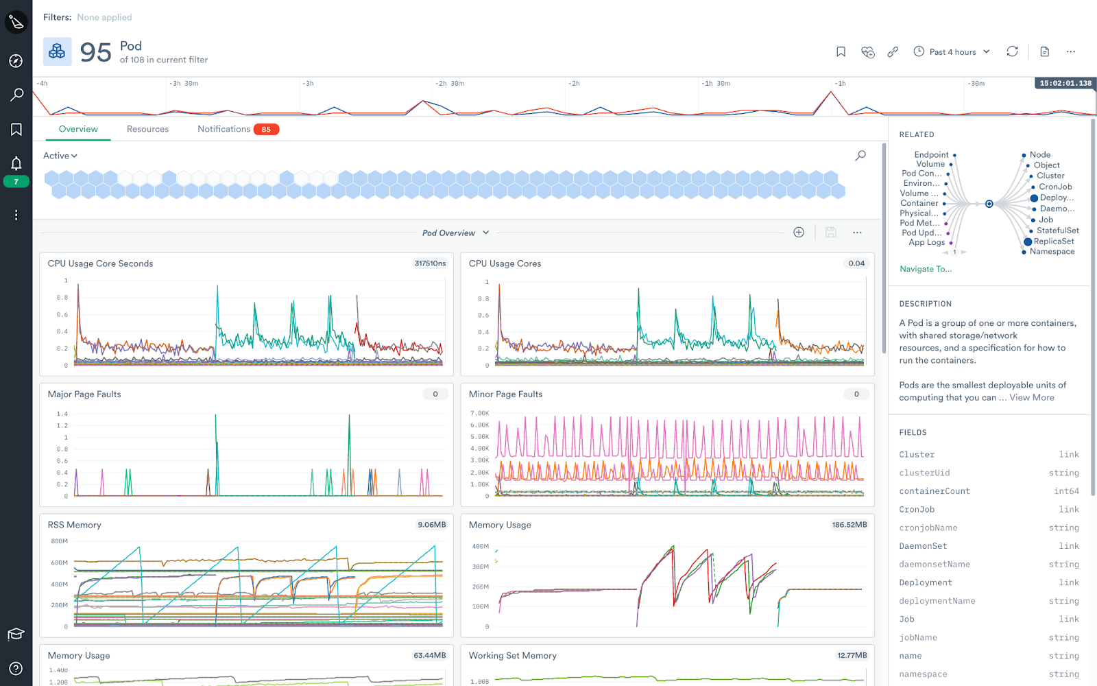
We’ve taken this opportunity to rethink how users navigate the product and consolidate list pages in a single place. You will also notice that the navigation rail has some new functionality. The first addition is the new “Explore” page, where you can explore your datasets, worksheets, and resources. There are also additional filtering and grouping options that allow you to look at objects by application, user, etc.
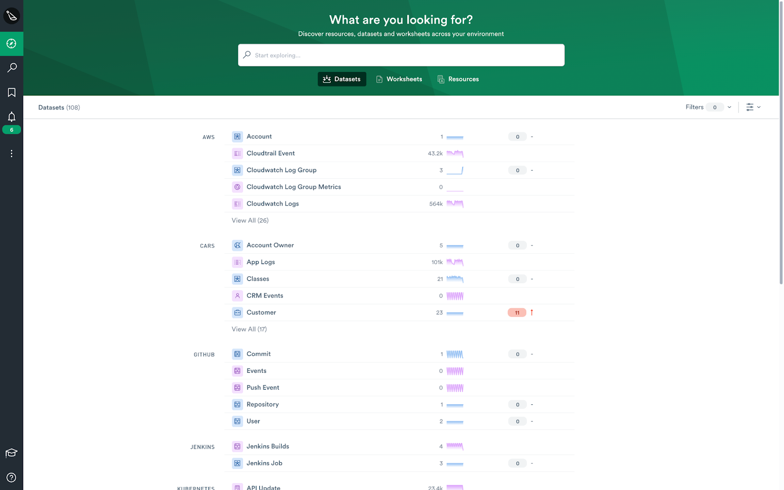
This makes viewing logical groupings of datasets easier. For example, you can see all of the content that comes out of the box for Kubernetes or AWS in one place.
TIP: You can even create your own grouping by using a “/” in your dataset name. (e.g. “Enron/servers)”
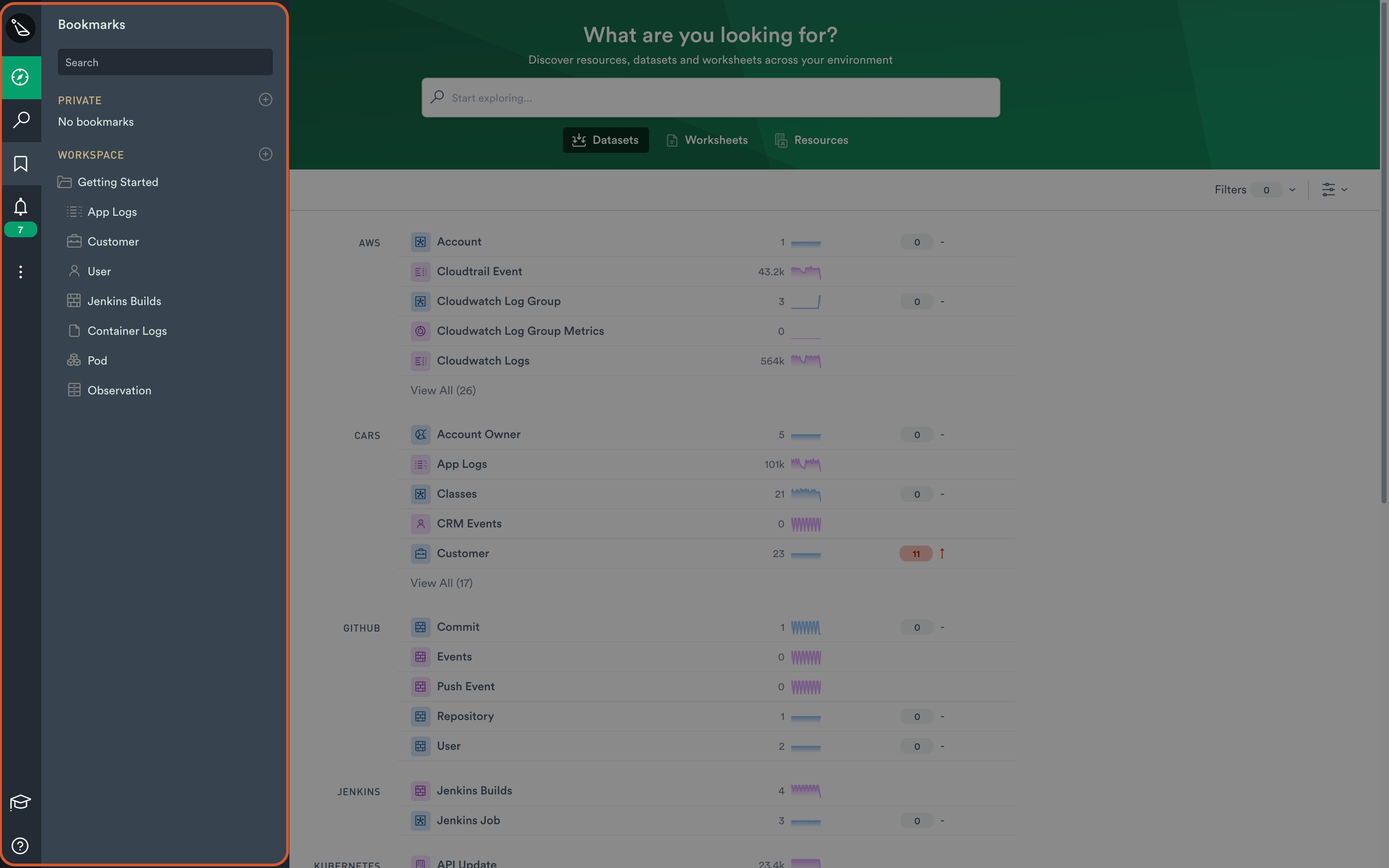
Bookmarks
Another feature we found missing was a way to organize your Observe workspace. To do this we created Bookmarks, and they work just as you’d expect. You can bookmark boards and worksheets, as well as create folders. If you have any filters saved, they will persist until you remove them. For example, you might only care about EC2 instances in the us-west-1 region. You can filter down to EC2 instances only in that region and then bookmark the board. These can be shared with every user in your workspace or saved privately.
Notifications and Quick Search
Notifications and Quick Search have always been present on the navigation rail, but we’ve now included their results there too. The result is a much faster and easier search experience. You no longer have to leave a page or wait for a pop-up to surface. As an added bonus, we now keep track of all your recently accessed datasets.
Workflow Improvements
In addition to improving navigation, we’ve also added a few enhancements to improve the troubleshooting workflow experience.
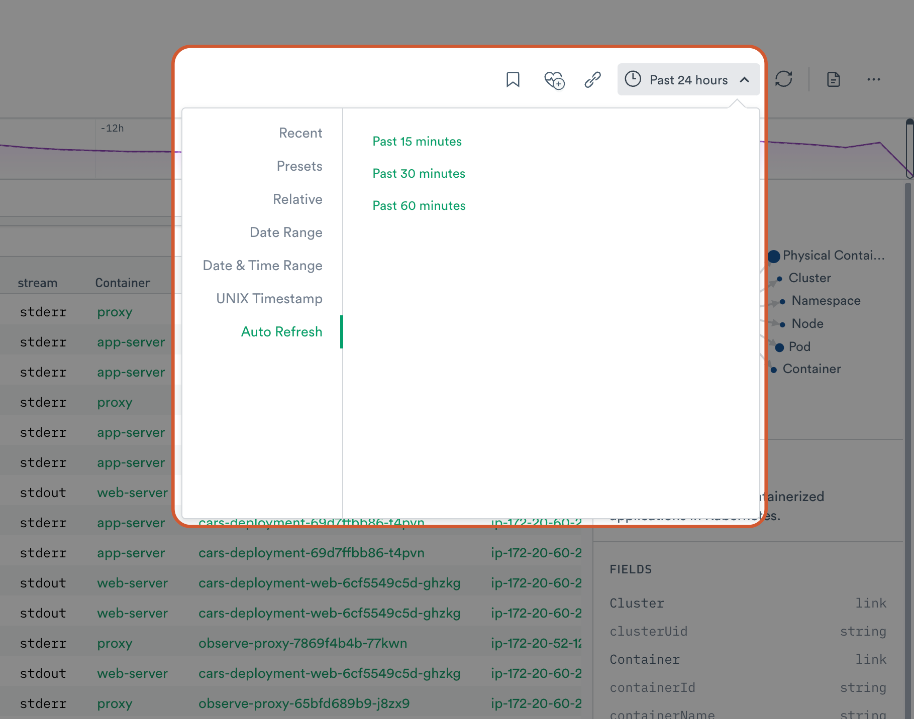
Auto-Refresh
All of our time pickers now have an auto-refresh option. Observe can automatically refresh any page when new data is available, for timely and relevant searches. As a safety switch, the auto-refresh function will automatically stop after fifteen minutes of user inactivity. This helps prevent customers from running up a large bill if they leave Observe open while on holiday.
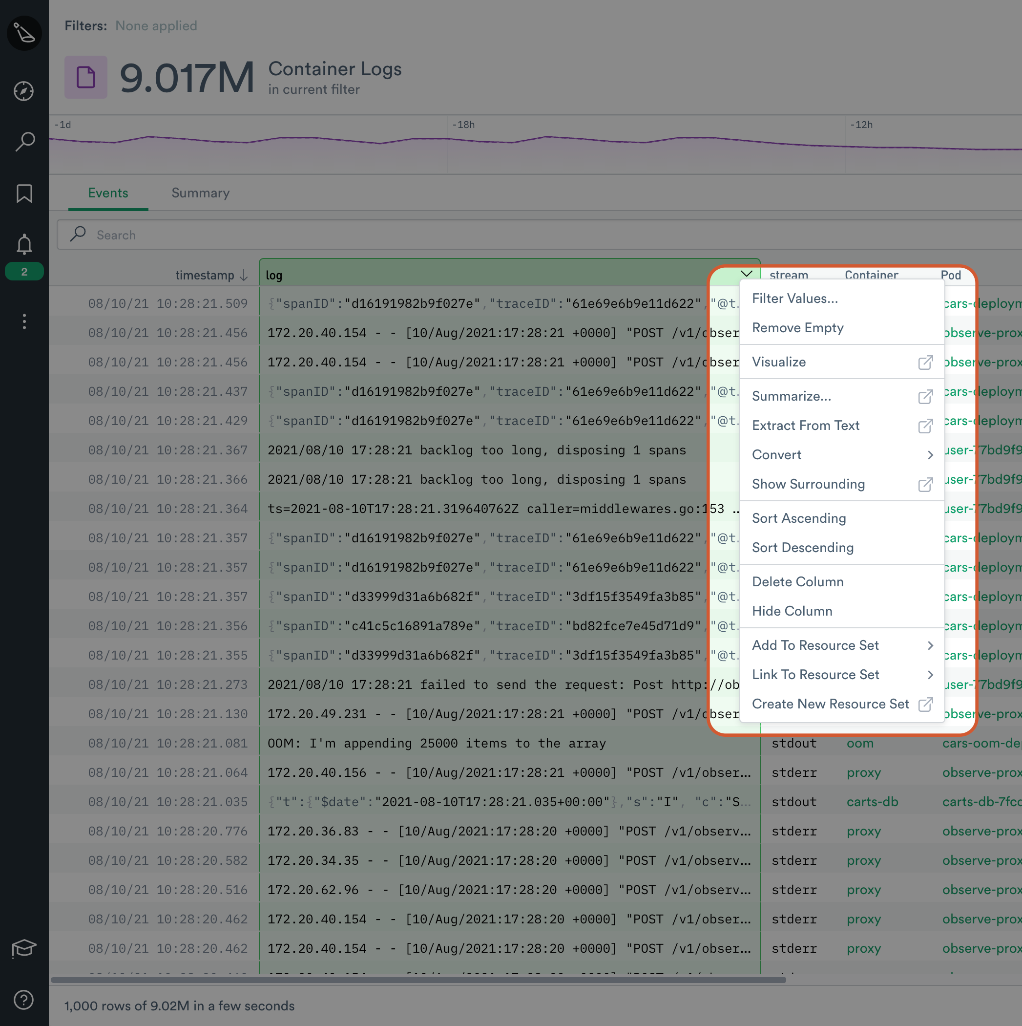
Move Seamlessly Between Boards and Worksheets
One of the great things about Observe is that you can always drill down further and easily manipulate raw data. We’ve made this even more painless to do from inside a board. Previously you would need to open a dataset using the Worksheet view. With this new update, we now display all of the available worksheet actions on boards. They can be found by the “![]() ” icon. When clicked, we automatically launch you into a worksheet with all of your filters persisted.
” icon. When clicked, we automatically launch you into a worksheet with all of your filters persisted.
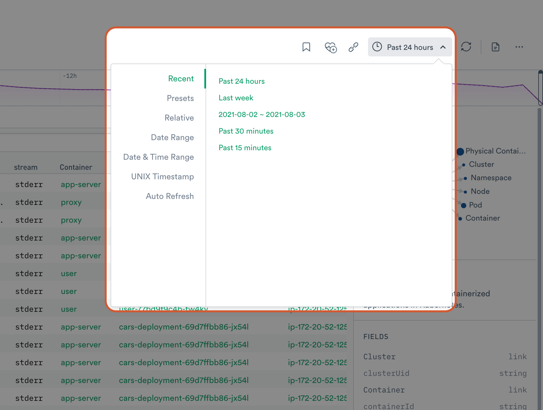
Recently Used Time Ranges
We now keep track of recently used time ranges. Say goodbye to copy and pasting them across the UI.
Visualization Cards Y-axis
All visualization cards now have the Y-axis enabled by default, as well as an increased default width. Before this change, users had to edit every card manually.
Thank you
We want to give a big shout-out to our early adopter customers for their feedback and beta testing. Without them, we simply would not be able to build a customer-driven product.