What’s New: Dashboards
 By Liam Rogers,September 12, 2022
We wanted dashboards to go beyond high-level and isolated summaries and instead be a starting point for your investigation.
TLDR:
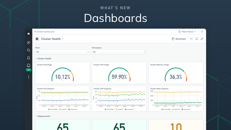
During our Observe Direct Spring 2022 event, we announced that updates were coming to our dashboards – well good news, they’re here! Dashboards are now deeper (really deep) and not just a superficial look at data. Thanks to the integration with Graphlink, dashboard visualizations are now a portal to easily explore your datasets.
Dashboards are now a first-class citizen in Observe and they’re even easier to customize now via a dedicated page and editor. There’s also more out-of-the-box content for supported integrations. With enhanced filtering, you can also easily change the resource parameter at the heart of a dashboard to get new insights without having to reproduce a dashboard multiple times.
Dashboards in general are useful because they let users quickly see trends and outliers based on their data, in a visually intuitive way. It’s not uncommon for users to even spend considerable time devising the ideal dashboard for their specific needs. However, even the most customizable third-party dashboard creation tools can fall short when the time comes to dig into the data behind them.
This is where Observe differs from other tools, the data in your dashboards is the starting point for exploration and not just a static visual indicator. With the depth that dashboards can now provide in Observe, they’re like a wormhole to help you quickly traverse your data universe.
So What’s New?
In Observe you can auto-generate dashboards based on your datasets to get you up and running fast. Already have a great worksheet? That can be the starting point for your dashboard. However, to meet even the most specific needs you can now start entirely from scratch and build only what you want. You can read more about the dashboard creation process in the docs update out now.

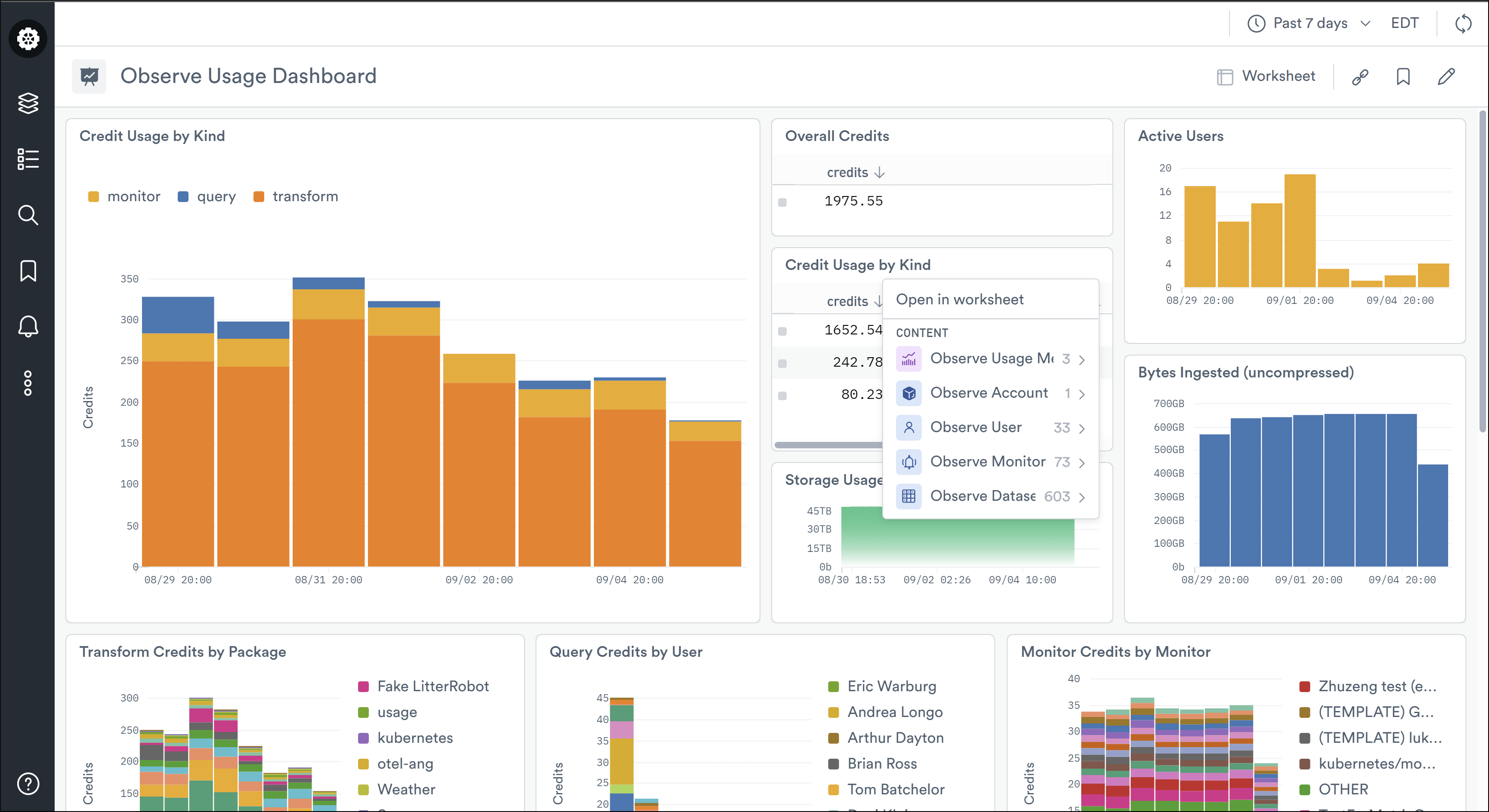
Dashboards + Graphlink = Data Universe
Observe’s data universe had previously consisted of all the datasets modeling your system’s data, but now, Dashboards fit directly into that universe and are directly linkable to the data in your system. We wanted dashboards to go beyond the high-level and isolated summaries and instead be a starting point for your investigation. We’ve accomplished this by integrating Graphlink which lets users jump between different sets of data. Now, what appears in your dashboards is connected to your datasets, as well as the broader universe map of your organization. From the cards (the charts and visualizations) in your dashboard, you can click through to see resources related to those in the card. The quick demo below shows how you can dive into your data from the higher-level visualizations.
This functionality is crucial for reducing MTTR. For many organizations, it’s common to have to jump between multiple tools as part of an investigation and isolated dashboards are one clear bottleneck. Dashboards are a small window into a lot of observability data. With the Graphlink integration, your dashboard is now a gateway to exploring that data.
Parameters, Customization, and UI
There’s now UI support for more of what can be done with OPAL, namely resource parameters. Parameters are not dashboard-specific, but you can use them in your dashboards as you would event streams or resource sets. By using parameters you can introduce more repeatability and dedupe the effort needed to create dashboards. Built a dashboard to look at a specific user or a specific pod? Now you can easily filter the parameter to look at a different user or pod without having to go to another dashboard page or build a new one entirely. With five different parameter types, you can be sure that dashboards can be configured to give you the granular insights you need without losing the ability to launch into exploring your Dataset Graph.
Our frontend team has also made several quality-of-life improvements to make building dashboards easier and more straightforward. Drag and drop functionality while building or modifying dashboards is more flexible than ever. You can add any data source to your dashboard and there are multiple ways to visualize and chart data streams to meet your needs.
What to Look Forward to
Observe’s ability to know the context around your data to help you understand the “things” that are important to your business is a key differentiator that we’ve now brought through to dashboards. We know this will be a game-changer compared to the way dashboards have been used in the past. However, there’s still more to come to make them even more powerful.
Two other key announcements are Observe apps and our metric expression builder and they both have implications for dashboards. To provide even more out-of-the-box functionality for customers there are/will be automatic dashboards with relevant metrics for the stability of integrations found in apps. As we continue to expand the range of apps available there will be curated automatic dashboards to go along with them to help you get up and running fast.
It’s faster than ever to bring relevant metrics into dashboards and with the metric expression builder, and it’s also easier to define custom metrics. To further unify the experience between metrics and dashboards we’ll be bringing the expression builder into dashboards so stay tuned.
If you’re interested in dashboards that let you dig into your data universe then get started with Observe by requesting trial access here.